Sav · Domains · 2022–2024

Every domain flow, from search to sale,
redesigned as one product.

Sav went from 1 million to 2 million domains in six months, and its customer experience did not keep up. Buying, selling and managing a domain each felt like a different product. We gave every flow one design language.

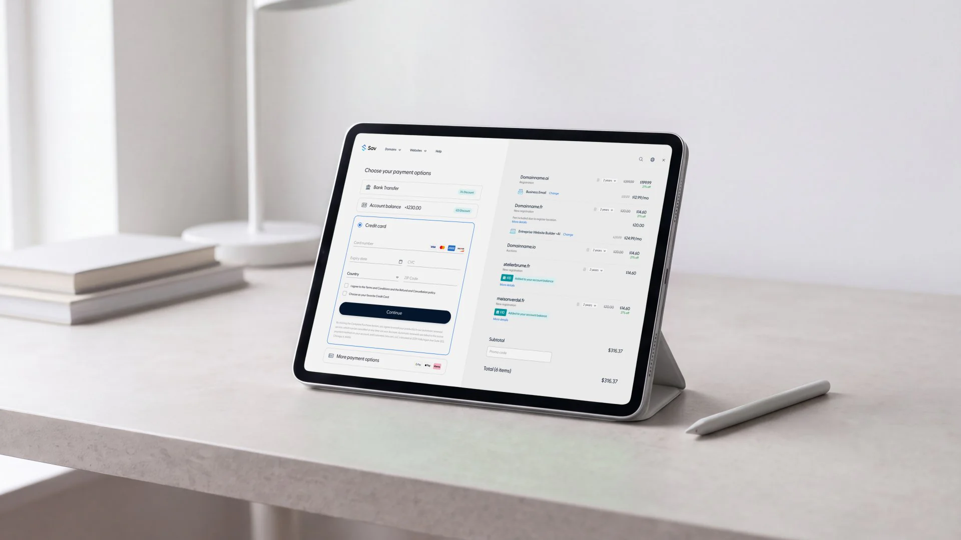
Sav's checkout on a tablet in a folio stand on a pale stone desk: the payment options beside the cart
The results
3×conversion rate, from 3% to 9%
50%less churn
60%12-month retention, up from 45%
80%purchase completion, up from 55%
The problem

The problem

Sav is a domain registrar and marketplace, with customers in more than 90 countries and over 2 million domains at its peak. Its core customers were domain investors, trading names on a marketplace with the industry's lowest commission, 4%.

By late 2022, the platform had outgrown its design. Support tickets and our own review of the product pointed to three issues. The domain manager fragmented customer information and was hard to navigate. Search was too basic to surface relevant results. Auction pages lacked a clear visual hierarchy.

Friction and churn were high, and retention was low. Sav also wanted to reach a broader audience: people starting a business, from online creators to aspiring shop owners.

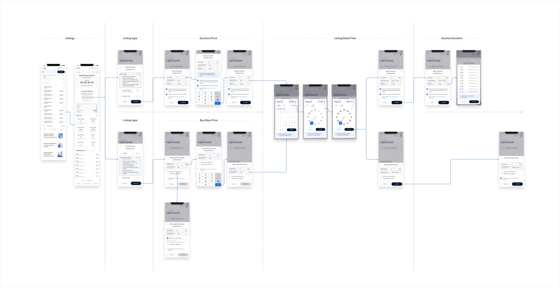
A map of Sav's domain relisting flow: from the listings to a closed auction, then the listing type, the auction or Buy Now price, the date and time, the auction duration and the confirmation, each step shown as phone screens
Where we started

The platform worked, but it felt disconnected.

We began by mapping the platform as it stood, working remotely with Nick Roskam, Sav's CTO in Chicago, and the development team in India. Features had been added over time with no single design behind them.

The relisting flow we redesigned, from a closed auction to a new listing

The decision

Make domain management
obvious.

While running workshops with Sav's main stakeholders, we worked closely with Nick, the CTO, to define the information architecture: the navigation model, where each feature sits and how the sections relate. He gave us room to propose what we believed would add value, and we worked through the key points with Sav's CEO.

We agreed on the priorities: less friction across the customer journey, one visual and interaction language, an experience that welcomed newcomers as well as domain investors, and a foundation for the AI website builder Sav was planning. We planned the work around engineering capacity and expected impact.

We held every design to one test: can a customer go from searching for a domain to owning it to building a website on it, without confusion at any step?

Version 2 shipped most of the new flows in a single release. A phased rollout was not practical.
What we designed

Four parts of one customer journey.

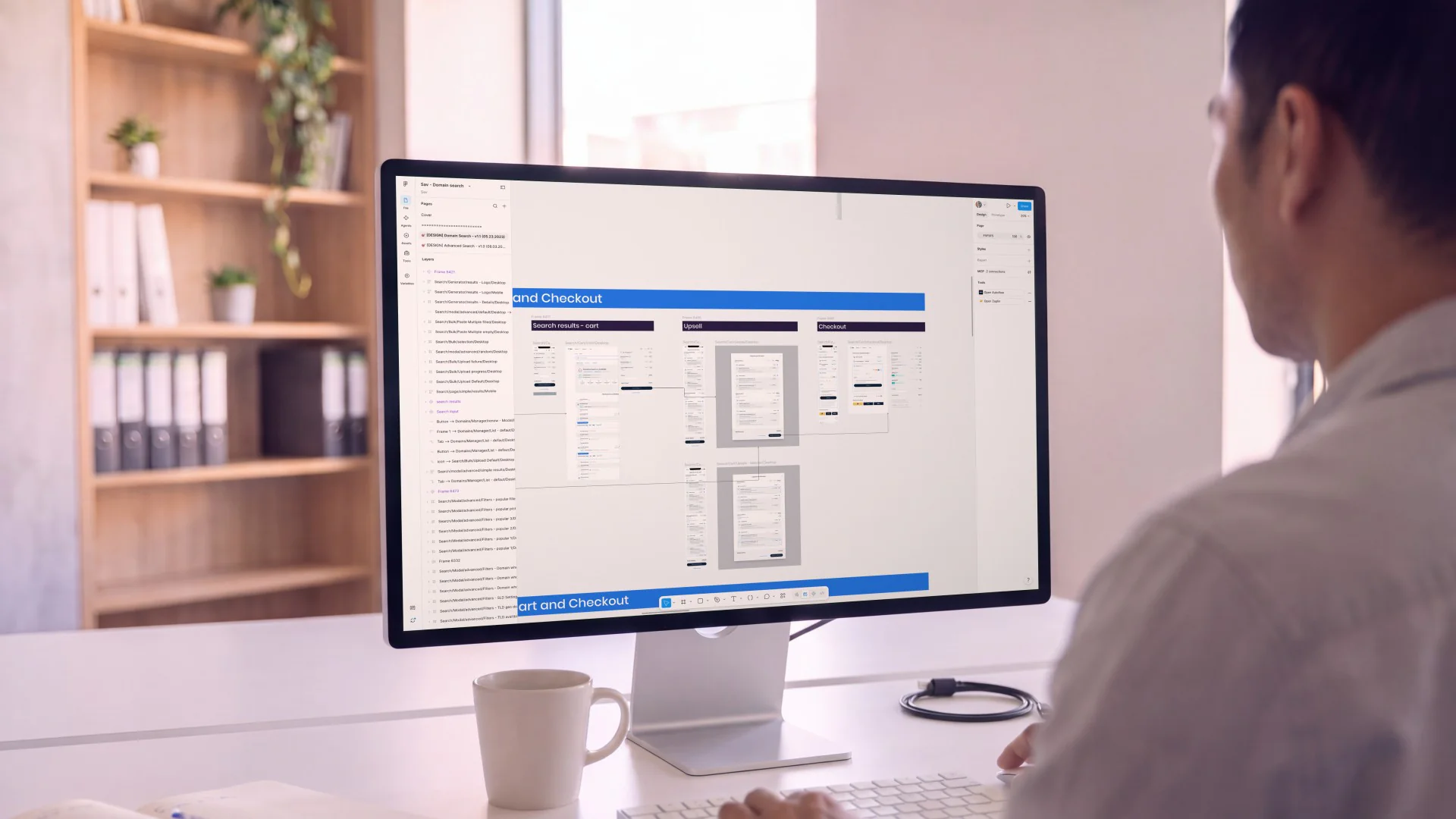
A designer at a desktop monitor reviewing Sav's search, upsell and checkout screens in Figma
01 · Search and checkout

Finding and paying for a domain, made clear.

We streamlined domain search and the checkout that follows it. The payment step offers bank transfer, account balance and card, with Google Pay, Apple Pay and Klarna under more payment options.

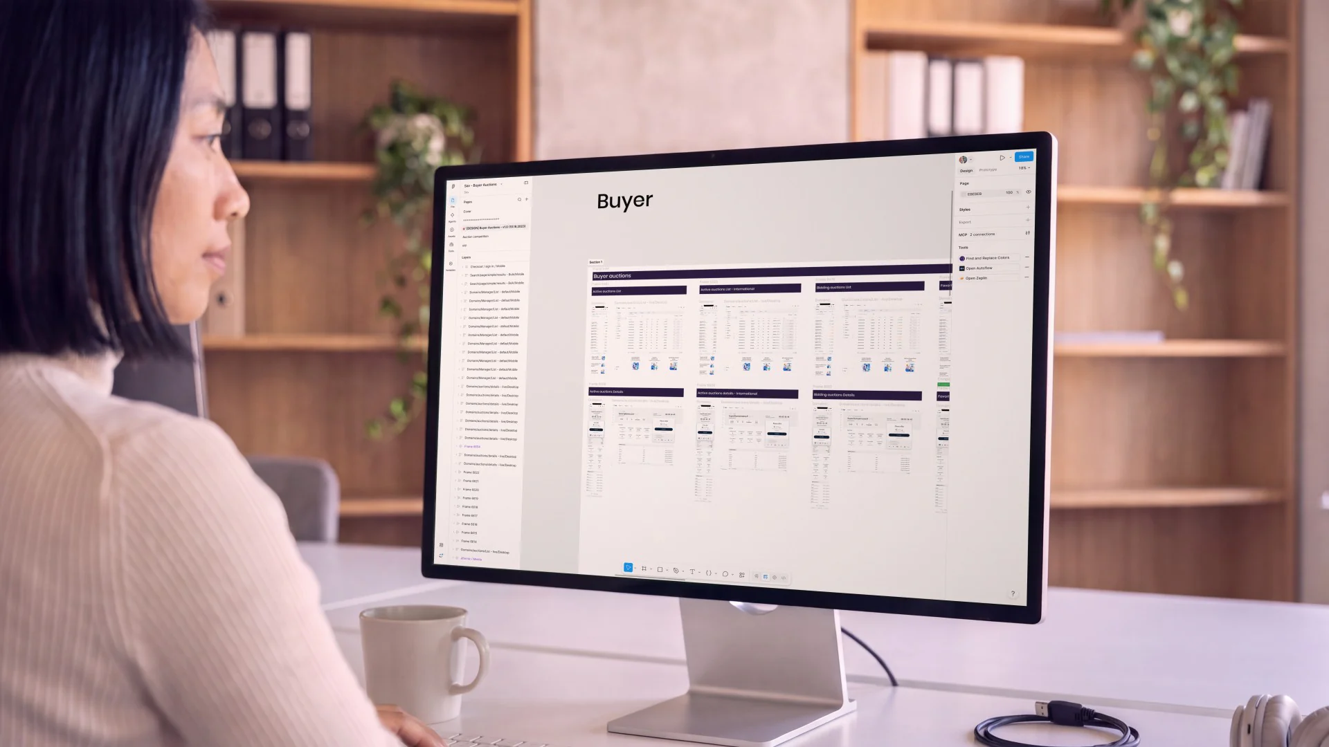
A designer at a desktop monitor reviewing Sav's buyer auction screens in Figma
02 · The marketplace

Buying and selling, with as little friction as possible.

We designed the marketplace flows: bidding in an auction, buying at a fixed Buy Now price, making or accepting an offer, and relisting a domain when an auction closes unsold.

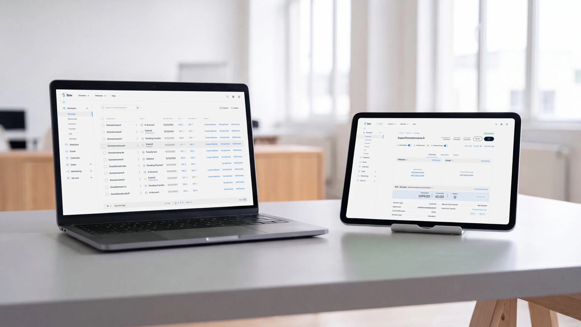
Sav on a laptop and a tablet on a grey table in a bright office: the domain manager list on the laptop, and a domain's overview with its auction panel on the tablet
03 · Domain management

Portfolio, DNS and transfers, designed together.

The portfolio view, DNS settings and transfers were brought under the same design as the rest of the platform.

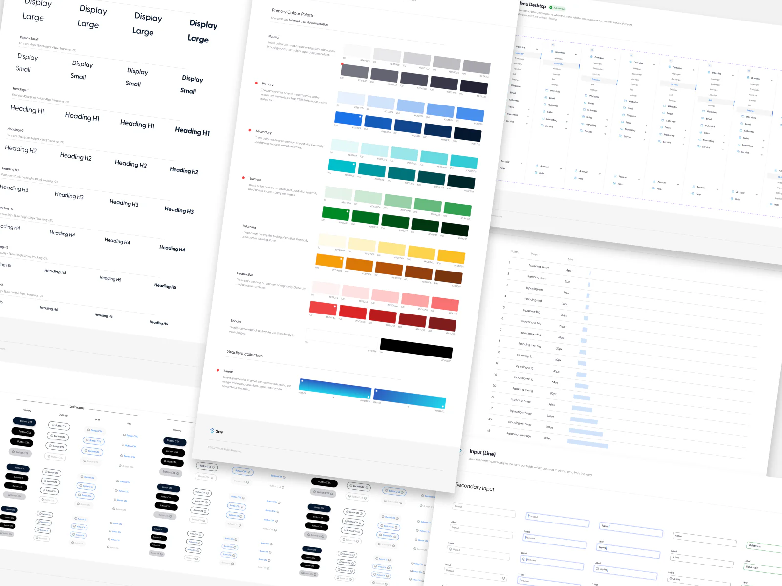
Pages from Sav's design system seen at an angle: type styles, colour palettes, spacing, buttons, inputs and the desktop menu
04 · The design system

One system behind every screen.

We built the designs as a system: one set of components, type styles, colours and spacing in Sav's brand, used across the whole product.

How the work ran

How the work ran

  1. 01

    About 20 months on the redesign, from 2022.

  2. 02

    We led design across a distributed team, keeping quality consistent from design to release.

  3. 03

    We led the design and made sure what shipped matched it, settling the trade-offs between design and engineering along the way.

  4. 04

    Six to nine months after the redesign shipped, Sav came back for the next phase: the AI website builder.

  5. 05

    We designed the experience of the AI builder, where customers describe what they want and get a complete website, and connected it to buying a domain, so customers without one get domain suggestions as they build.

Two business partners in a glass-walled meeting room, looking at Sav's domain search page in Safari on one laptop
Sav's marketing website, which we also designed

In people's hands

A business owner at the desk of his small office, bidding in a live Sav domain auction in Safari on his laptop
A woman by the window of an open-plan office, checking a live Sav domain auction on her phone
“Boald has been an exceptional product partner. Their eye for detail and inventive thinking have noticeably sharpened our user experience.”
Nick RoskamCTO, Sav

What would make your
product obvious?

Every Boald engagement starts with the question this project answered.